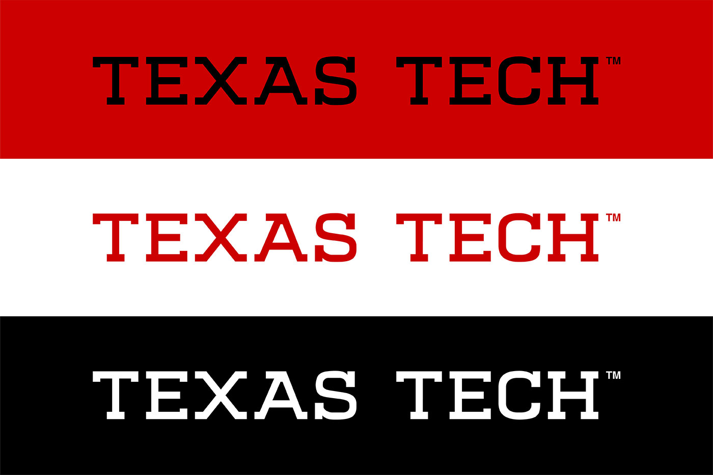
This is the first thorough revision of Texas Tech’s word mark in almost two decades.
The last time Texas Tech University changed its signature word mark, Apple was still two years away from releasing its first iPhone and YouTube had just launched.
Technology and communication have been revolutionized in the nearly two decades since. Now, even those with minimal technological skills can use their smartphones, tablets and computers to design things previously thought unimaginable and communicate in methods once thought to be pure science fiction.
These changes have necessitated Texas Tech to update its identity guidelines, which means a new word mark that brings the university’s branding to the forefront. Today, Texas Tech debuts its new word mark that, when paired with the Double T, embraces the spirit and character of Texas Tech.
“Texas Tech’s visual identity is more than a logo or a set of colors. It represents our values, aspirations and commitment to excellence,” said Matt Dewey, vice president for Marketing & Communications. “After months of planning, research and collaboration, we have developed a new visual identity system that captures the essence of what Texas Tech is and where it’s headed.”
The new Texas Tech word mark balances the university’s history and tradition with a modern collegiate representation of the university name. Its letterforms are inspired by the Double T, creating a strong and recognizable graphic that boldly reinforces what Texas Tech is.
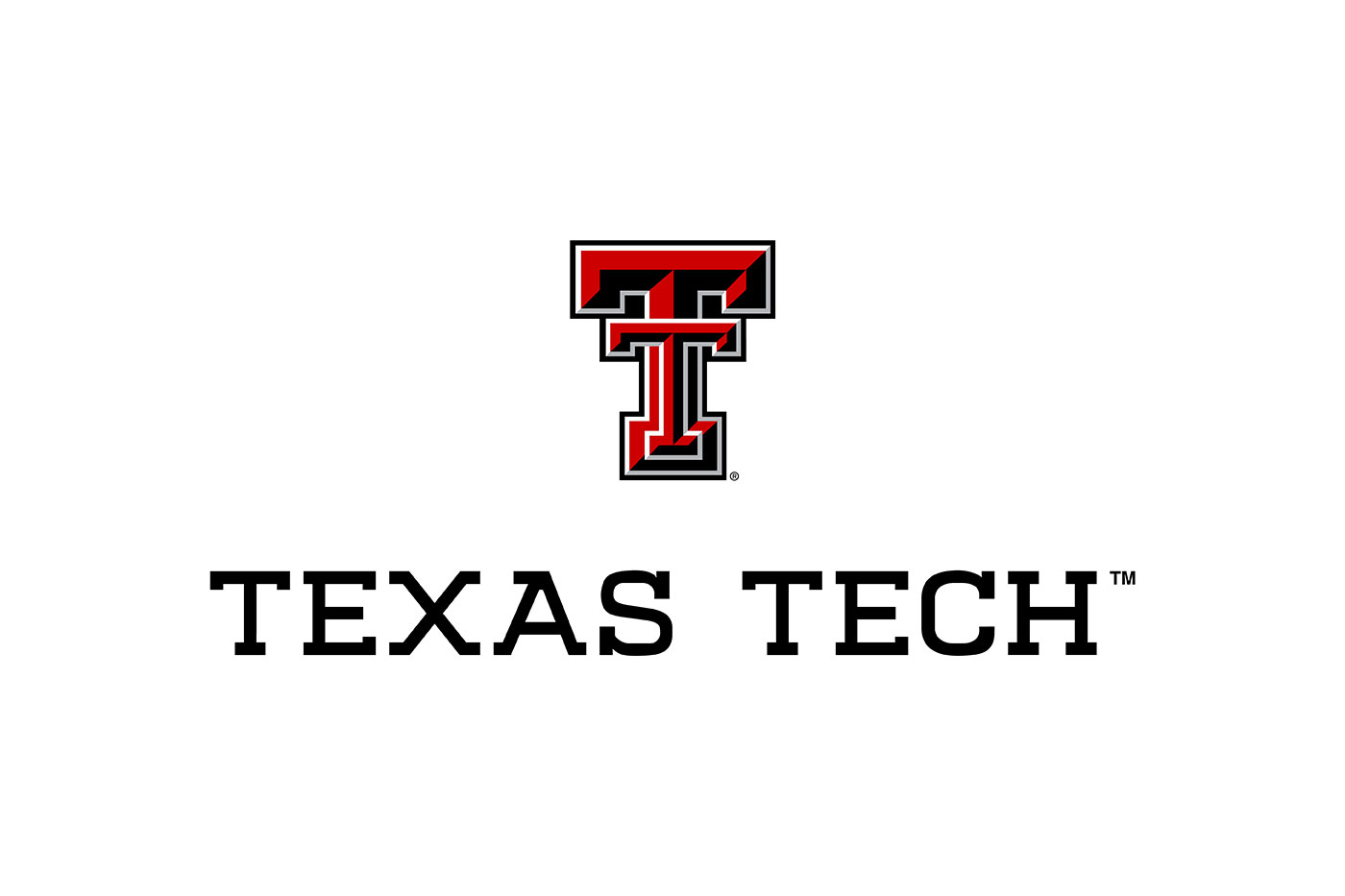
Texas Tech’s branding reflects its modern innovation, academic advancements and continuous growth and achievements. It also ensures consistency with the brand throughout all colleges and departments within Texas Tech, presenting a flexible yet uniform appearance. The Double T, one of the most iconic logos in all of higher education, will remain the same.
To learn more about Texas Tech’s new visual identity system, visit the brand website.
