Visual Identity
Logos
Texas Tech Word Mark
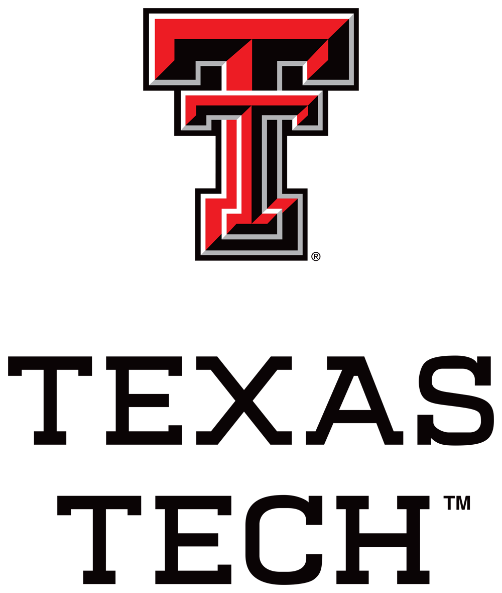
The Texas Tech word mark is assertive and confident with unexpected letterforms that create a strong and recognizable graphic.
Combined with the Double T, the custom word mark embraces our spirit and character.
It is inspired by the shape and weight of the Double T itself, boldly reinforcing the identity of Texas Tech. It balances our history and tradition with a modern collegiate representation of the university name.
The word mark design has a natural visual weight combined with quirky and unique details found in the serifs of the X, A, S and C. Another distinct detail is the slightly lowered crossbar of the A, creating a larger than normal counter.
The Texas Tech name holds the highest position in the hierarchy of the brand architecture. The purpose of the university as a whole is the driver of all messaging developed across the institution.
Texas Tech should be represented in everything produced by the university.
When using the Texas Tech word mark, the height of the Double T must be equal to or greater than 0.33 inches.
The clear space (the space on all sides of the mark that should remain clear from other type or graphics) should be equal to half the width of the Double T in the logo.


Double T
The Double T is our most beloved and visible symbol. It plays a vital role in promoting Texas Tech University by providing a strong and recognizable graphic image, which creates a great sense of pride and connection among all generations of the Texas Tech community.

From Here, It's Possible™
These four words are ours. They're the essence of everything we believe in at Texas Tech. They're our promise to our students and to the world. They're a rallying cry that unites us, a reassurance in the face of doubt and an invitation to take on the impossible.


University Signatures
Formal College Signatures
Formal College Signatures contain the official name of a college or school, including the donor's name, if applicable. These signatures should be used in applications where external audiences, who may need brand association, will see the formal graphic. Examples can include print and out-of-home advertising and prospective student outreach.
Preferred Variation
The preferred number of lines a college or school's name should be on is two. If necessary, three lines is acceptable.

Donor Variation
When applicable, there is a donor name version of the university signature available.

Casual College Signatures
Casual College Signatures simplify the college's name down to one to two words, or how the college is commonly known to the Texas Tech community. The Casual College Signature should be used most of the time, with examples of use like merchandise, alumni communications and signage around campus.


Unit Signatures
Unit Signatures will always carry the Texas Tech name and the Double T. Unit Signatures must always feature the organizational hierarchy of units. For example, if the unit is a department within a college, the college's name must be featured. This ensures the unit will have direct association with not only their root organizational unit, but also with the university as a whole.


Acronyms
The formal signature should be used when targeting external audiences. However, an acronym version of the university signature may be used for flexibility with restrictive print areas.
Retired Logos
These Logos have been retired by Texas Tech University and are no longer available for use.
With increased access to the Double T, custom marks will no longer be necessary or approved.


Fonts
Departments are responsible for purchasing university fonts as needed.
Neue Plak
Neue Plak is used in the Texas Tech University brand system. It can be purchased through MyFonts.com for designing with the visual identity system elements.

Neutraface Slab
Neutraface Slab Text is used in Texas Tech's From Here, It's Possible™ campaign. It can be purchased through House Industries.

Helvetica Neue
Helvetica Neue is used in Texas Tech's From Here, It's Possible™ campaign and on Texas Tech's webpages. It can be purchased through MyFonts.com. The full font family is recommended.

Colors
Primary Colors
In 1926, Texas Tech students selected the school colors, scarlet and black, during convocation. The colors represent a full matador's colors, a red cape and black costume.
Our core colors should be front and center on all external projects to reinforce the image of Texas Tech University to a broad audience.
Black
CMYK 0,0,0,100
Pantone Process Black C
RGB 0,0,0
HEX #000000
Red
CMYK 0,100,100,0
Pantone 485 C
RGB 233, 8, 2
HEX #E90802
White
CMYK 0,0,0,0
RGB 255,255,255
HEX #FFFFFF
Complementary Colors
Light Gray
Web Only
HEX #EDEDED
Dark Gray
CMYK 0,0,0,70
Pantone Cool Gray 11C
RGB 51,51,51
HEX #333333
Medium Gray
CMYK 13, 9, 10, 27
Pantone Cool Gray 5C
RGB 117, 117, 117
HEX #757575
Tertiary Colors (Print Only)
These colors mirror the architecture and campus of Texas Tech. They are meant as complements to enhance the Texas Tech look.
Consider using these colors as highlights for internal campaigns or events.
Light Green
CMYK 10,0,49,28
Pantone 5777C
Light Blue
CMYK 30,4,0,31
Pantone 5425C
Light Brown
CMYK 6,9,23,0
Pantone: 468C
Dark Green
CMYK 34,0,81,71
Pantone 574C
Dark Blue
CMYK 100,55,0,55
Pantone 540C
Dark Brown
CMYK 20,32,58,0
Pantone 465C
Need More Information?
Contact Blake Ferguson (blakefer@ttu.edu) or Veronica Medina (veronica.medina@ttu.edu).
Texas Tech faculty and staff can join us on Microsoft Teams to learn more about our visual identity.
The Texas Tech Brand
-
Address
Texas Tech University, 2500 Broadway, Lubbock, TX 79409 -
Phone
806.742.2136 -
Email
mkt.comm@ttu.edu
